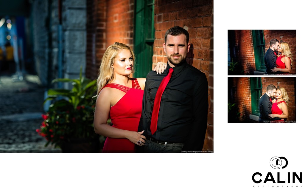
This album spread is composed of a succession of three engagement photos taken in the Distillery District.
During this part of engagement shoot we went to the Distillery District minutes before sunset. As we were losing light, we had to move fast. I noticed the pocket of light that looked like a spotlight. I asked the couple to position themselves in that spot. From here I did three variations of the same pose.
Usually, when I photograph a couple the emphasis is on the girl. However, in this first image that shows to focus on the groom first, so I asked Taylor to look of the camera. Next, I told Katerina to come close to Taylor, to put one hand on his shoulder to grab his arm with the other hand and look at him. The beam of light shining onto the couple gives this image a cinematic look. Katerina and Taylor are the brightest part of the image so your eye travels directly onto them. Their position according to the rule of thirds and the fact that Katerina looks at Taylor creates a virtual leading line towards him. The image is also visually pleasing as Katerina is wearing a red (primary colour) dress which makes her stand out. Her lipstick matches the dress colour and Taylor's tie.
The second image in the series has a voyeuristic feel and portrays the couple kissing. Finally, in the third image in the series Katerina turns her head away from Taylor in a more fashion like pose.
I have seen many engagement photos taken in the Distillery District but very few of them look this good. So, what makes them special? To start with, the lighting is absolutely beautiful. The light beam shining on the couple makes them "jump out of the picture." Next, the composition is outstanding. Katerina and Taylor are positioned according to the rule of thirds. Also the brick wall gives texture to the backdrop and emphasizes the subjects. Even more important, Katerina is wearing a red dress (primary colour) which makes her stand out. On the other hand Taylor is wearing a black shirt so his face is the brightest part of the picture, drawing wants attention to him and Katerina. Finally, I used a technique called the Dutch tilt in the second and third image to create more dynamic photographs.
Location: 21 Gristmill Lane, Toronto, ON M5A 3C4.